
Low inflation means real income growth
Posted Tuesday, January 19 2016
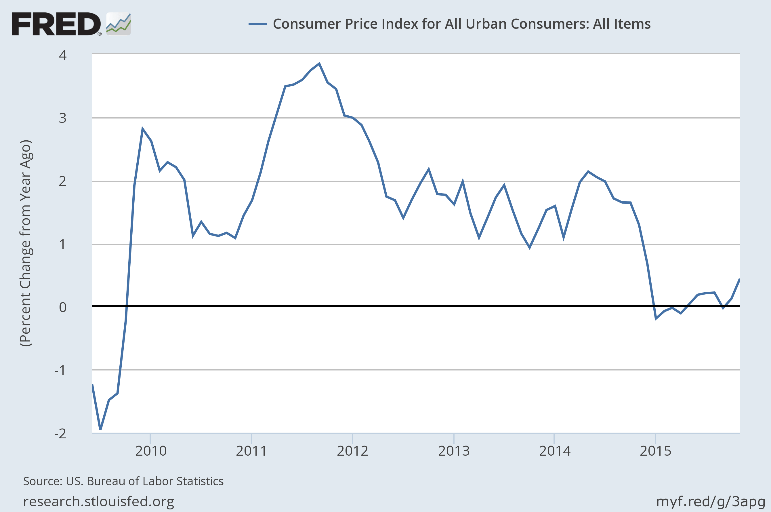
The Wall Street Journal highlights the low inflation environment we're currently experiencing is actually the product of two fairly strong trends nearly canceling each other out. Below is the chart of headline inflation as measured by the Consumer Price Index. Over the past year headline inflation by this measure has risen by about 0.5%.
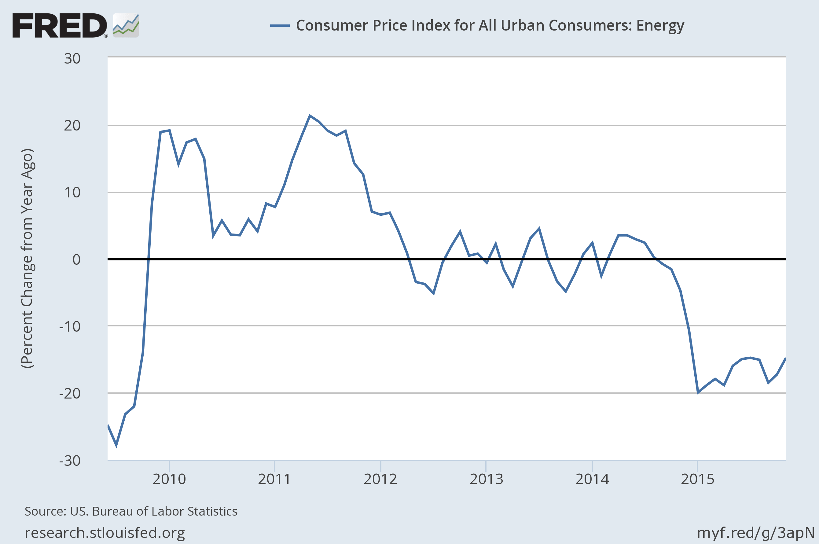
But this tame measure hides the fact that we've had a something approaching a price shock in oil. The energy component of the CPI (shown below) started 2015 down 20% Y/Y and was still down 15% Y/Y in November of 2015.
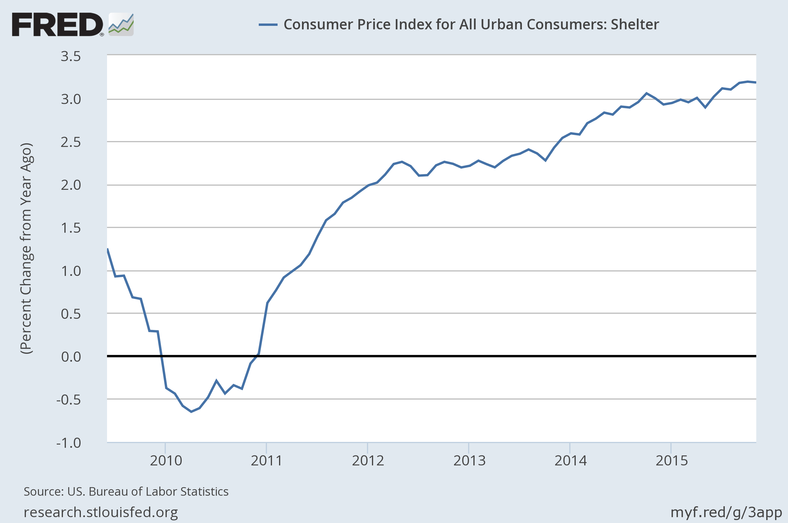
Compensating for this strong decline in inflation pressure is consistently rising shelter (predominantely rent) costs. Shelter is a larger component of the overall CPI than energy so its more modest 3% Y/Y increase (shown below) can substantially offset the 15% Y/Y drop in energy prices.
What do you do with these strong opposing signals? The Fed has correctly stated that even stabilizing oil prices will raise headline inflation and have at least in part moved to raise interest rates with that expectation. But let's not forget that, all else being equal, a low inflation environment yields rising real income. The chart below shows headline CPI since the end of the recession along with nominal average hourly earnings for all private employees.
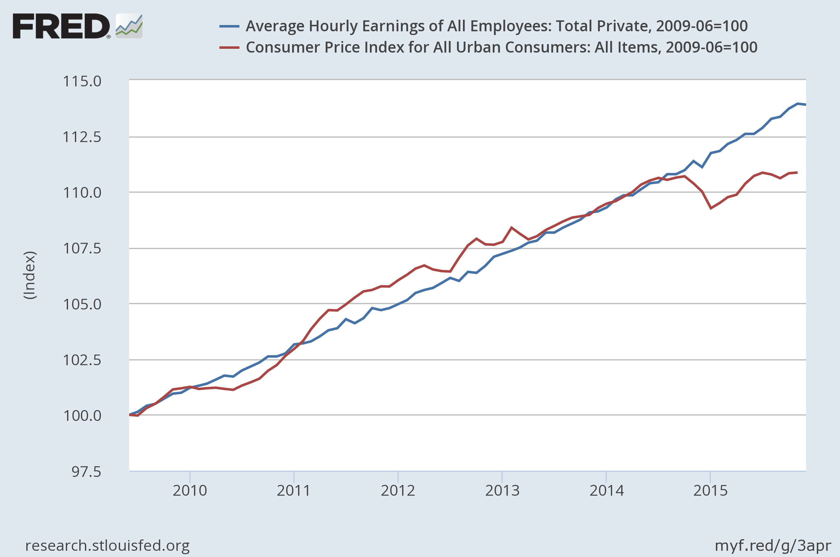
For now, and for the first time in any meaningful way since the recession, we're seeing wage growth in excess of inflation. This is part of the way real median household income regains ground lost over the last decade. Yes, rising rents are worrisome if the trend persists and I'd love to see monetary policy "normalize" sooner rather than later, but will we sacrifice real wage growth for normalization?
GDP compared to Household Income Aggregates
Posted Monday, May 19 2014
I'm gathering national and regional GDP data for a new section I'm working on to highlight local measures of economic activity, and I find that it automatically focuses one on the ways in which GDP is not the greatest way to represent local economic activity as experienced by the average resident of a region. The average resident's personal economy is probably pretty well captured by their income. Regional household economic growth might then be seen as the change in household income plus the change in the number of households. So what does aggregate household income growth look like compared to GDP growth then?
The chart below shows real US GDP growth since 2000 (blue) compared to total aggregate household income (green) and a statistic I made up which I'll call median aggregate income (red). If total aggregate household income can be thought of as average household income multiplied by the total number of households, median aggregate income is just median household income multiplied by the total number of households.
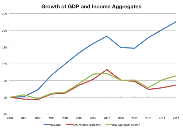
Measures of aggregate household income growth have not done nearly as well as GDP since 2000. They've grown, but not as fast the overall economy. The definition of GDI (a measure that should roughly equal GDP in theory) implies that business income has been growing more than household income. And this is indeed what we appear to be seeing, so increased profits to business accounts for at least some of the gap between aggregate income growth and GDP growth.
While the majority of households own at least some financial assets, which we might consider to be a flawed but rough proxy for exposure to business income, we can probably say that the average household does not derive a large fraction of their income from a share of ownership of a business in which they are not an employee. Analysing the distribution of that class of income is not trivial, however, so let's leave that investigation for another day. The point is that most people realize economic growth via growth in employment income which is the majority of their household income.
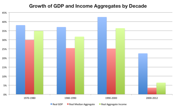
Looking at these measures decade by decade shows that growth was weak for all three in the aughts compared to the prior three decades. It also shows that household income aggregates used to grow more in line with the rate of GDP growth. Aggregate household economics fundamentally and uncharacteristically lagged this past decade.
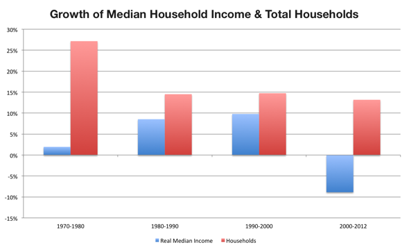
The change in median household income and the total number of households over the last three decades tells us why things have been so tough since 2000. While the number of households grew, it grew less than it had in previous decades (and I even used a twelve year decade in this case!). Individual households have suffered as median incomes have fallen in real terms since 2000. The only thing that actually allowed aggregate household income to grow at all was the increase in the number of households.
As I dig further into the GDP numbers, my guess is that population flows (i.e. the change in the number of households) will explain a lot of the regional economic growth we've seen in the US recently. Since this data is for the US as a whole, imagine the geographic benefit to regions/states/cities that have had population growth since 2000 (e.g. Austin) as well as the loss to regions/states/cities (e.g. Detroit) that have had population declines since 2000. The US aggregates above likely mask a widely varying regional picture.
Real Home Prices and Real Borrowing Costs Since the Bottom
Posted Tuesday, February 04 2014
I previously showed that continuously declining interest rates since 1980 have been a boon to the buying power of homeowners despite stagnant incomes. After the bursting of the housing bubble last decade and subsequent fall in home prices, the historically low interest rates that followed led to remarkably low payments for borrowers who could still qualify for mortgages these past few years. But we've long since put in a bottom for home prices. According to Case-Shiller's 20 city aggregate that bottom came in February of 2012.
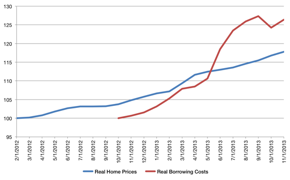
The chart above shows the change in real home prices (blue line) since the bottom. After February 2012 home prices began to rise while mortgage rates continued to fall. They fell enough in fact that their declines offset the rise in real home prices for another 8 months. That is, a borrower could obtain a lower mortgage payment via falling borrowing costs despite rising home prices. The bottom in terms of a monthly mortage payment didn't come till October of 2012. The red line shows how mortgage payments have changed since then.
In short, real home prices have risen about 17% since the February 2012 bottom, but the real price in terms of borrowing costs have risen just over 26%. I don't expect rates to leap in the near future, but if rates continue to rise with Fed tapering (they're up about one percentage point from the bottom) it could have a notable impact on affordability for first-time buyers. On the other hand, low existing home inventory suggests there hasn't been a significant falloff in demand yet and mortgage rates have been trending down again recently as well.
Growth in Mortgage Purchasing Power
Posted Wednesday, April 03 2013
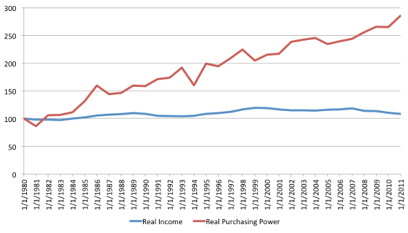
Above is a chart of real median household income and the real purchasing power of the same median household income when utilizing a 30-year mortgage. Said another way, if you kept the fraction of real median household income going towards a mortgage payment the same (say 30%), the red line shows the growth in what you could buy with your payment.
The chart highlights the dramatic rise in purchasing power of the median income household despite the lack of growth of the median household's real income. Growth in the capacity to borrow has replaced income growth over the last 30 years. Of course this is possible because interest rates have been falling continuously since the early 1980s making it feasible to borrow more and more with less income.
If we wanted to increase purchasing power in an environment where interest rates were not in decline, we'd need to see a substantial increase in real median income. For instance, say 30-year mortgage rates were at 6.5% instead of their recent level of roughly 3.5%. All else being equal, to get the same purchasing power as a 3.5% mortgage rate with a mortgage rate of 6.5% would require a 41% increase in real income! 1 Clearly (and by design in recent years), record low mortgage rates are a huge stimulus for home prices.
What happens when the 30+ year secular decline in interest rates ends? Even if rates stay low, the stimulus of declining rates on asset prices (homes in particular) will disappear. While incomes will likely increase over the next few years, we've already seen how much they would need to increase to match the purchasing power effects of falling interest rates. And if interest rates rise even modestly, purchasing power will be significantly curtailed. How home prices, under the additional influences of inertia and psychology, actually respond is another matter.
1. Assuming again that a borrower would want to spend the same fraction of their income on a mortgage payment regardless of the interest rate environment. ↩
Monetization Innovation
Posted Tuesday, January 08 2013
One of the most fascinating new memes to emerge in the last year or two from the econo-web is that of abundance. How is and how will abundance brought on by increased mechanization of production shape economic development? Will it displace labor in the long run or will it open up new avenues for work capable of employing as many (or more) people than the labor it displaces? Will it lead to more leisure for society as a whole? What happens when we can affordably produce a great many things because the tools of production are widely available and/or the marginal costs of production are so low?
First off I should say that this is not a traditional Department of Numbers post. I've got no illuminating time series or chart to go along with this commentary. Instead I'm just offering some minimally filtered thoughts on a subject I'm reading about a lot these days. And this is all a little out there and Star Trek-y as well, so don't take it too seriously.
The Internet is an obvious starting point for thinking about abundance. It is a platform that democratizes the tools of digital production and a place to consume that production as well. When the tools of production are broadly available you have the potential for a relative abundance of whatever it is that is being produced. The digital world may be leading the way here, but for a certain class of goods the physical world is following close behind on a similar trajectory.
The first question to ask then is: what's wrong with abundance? What could possibly be wrong with having access to lots of cheap stuff that we want? I would argue that the main problem with abundance is that it removes that which is abundant from the money economy. Take air or water. Both are obviously critically valuable, but for all intents and purposes we consume them freely. We don't generally participate in a market exchanging money for either one. Thus air and water (and much of the natural environment in general) are an externality in many transactions — their consideration is largely excluded from our money economy. The results of this have arguably led to long term environmental degradation as we have inappropriately valued their worth to us.
Technological abundance, to me, looks like something similar. As we move towards it, we remove that which is technologically abundant from the money economy. And this is where the abundance discussion I see around the web makes me anxious. There is a lot of talk about the gift economy or the collaborative economy — unpaid or minimally paid labor essentially. That is, there is a lot of reasoning why people will increasingly do things for free that will create value for society (and/or corporations). I don't disagree that this will happen; it clearly is happening already at a significant scale. But as with the environment, there will be consequences for inappropriately valuing critical components of our economy. For one, society benefits greatly from the generosity of people participating in some of these unpaid ventures, but yet we still force them to participate in a money economy. You can't pay your rent with Wikipedia edits. Is a world where only certain classes of things are abundant or free really as utopian as it is sometimes portrayed to be, or are we just creating a class of work (and workers) that can be exploited back in the money based economy?
This dilemma makes me think that technological abundance and Tyler Cowen's Great Stagnation are really just two sides of the same coin. One of tenants of the stagnation theme is that "we are not as wealthy as we thought we were." That the booms of the aughts created a lot of fake wealth. But what if we simply don't account for our wealth correctly? What if our current economic system is a really effective heuristic for industrial development but is not complete enough to fit technological abundance under its umbrella? What if the wealth is there but we just haven't figured out an appropriate way to assign that wealth a dollar value? What if we're still a Google without an ad platform or an app developer without an app store? If our current economic platform doesn't monetize what we find valuable, shouldn't we try to extend the framework so that the model doesn't break with abundance? Do we really want a large unmoneyed economy to exist within and compete against the money economy? Because I have a feeling that the money economy wins that fight in the long run. Perhaps the best innovation we could hope for then is a mechanism for monetizing abundance.
A Thousand Bucks Buys You a Lot of House Right Now
Posted Sunday, November 25 2012
The chart below shows the increasing amounts of money you're able to borrow on a 30-year fixed rate mortgage with a $1,000 payment since 1971. I've been meaning to create this chart since I saw Matt Yglesias' post last month on the buying power of $1,000 over the last few years. As you can see, the trend isn't new. The amount that $1,000 buys you (in 2012 dollars) with a 30-year fixed rate mortgage has grown from roughly $64,000 in 1981 to $226,000 last month!
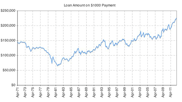
Of course the high rates of the early 1980s were as much of an anomaly as low rates are today. But even compared to the 6-8% 30-year mortgage rate range that prevailed in the 1990s, $1,000 still buys you about $75,000 more now.
But there's a limit to how far left we can move on the chart below. The 30-year fixed was 3.38% last month. I wouldn't have imagined it could ever get that low, but certainly we won't ever see 1% or even 2% rates. There really can't be much more oomph left in the price stimulus provided by falling mortgage rates.
Which brings me back to this chart of Case-Shiller real home prices and the financing cost of Case-Shiller real home prices that I showed a couple of months ago.
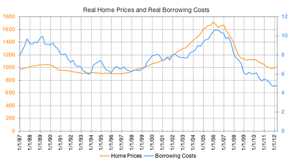
We've seen a huge drop in real home prices since 2005 and have only recently found a floor and stabilization. But when you look at the payments on homes purchased with borrowed money (the blue real borrowing cost line), the cost in terms of a monthly mortgage payment continues to decline because mortgage rates continue to hit new lows. In terms of the monthly mortgage payment, homes cost less than they ever have for the history of the Case-Shiller series. Truly, $1,000 buys you more home than it has in quite a while. You know, assuming you can get a mortgage.
Census ACS 2011 Income Data
Posted Thursday, September 20 2012
The Census release the 1-year ACS estimates today on a huge variety of topics. I've been collecting and organizing some of their income data here and have now imported the 2011 income data as well. For the US, 50 states and some 370 or so metropolitan areas, I've taken the Census' nominal household, family and per-capita income data and adjusted it for inflation. Browse through all the data here.
At the broadest geographical level, the US showed a real median household income decline of just over 2% to $50,502 in 2011. Since 2007 real median household income has declined by just over 8% in the US.
A quick look at the state results tell me that 9 states (plus the District of Columbia) showed real gains in median household income in 2011 while the rest posted real declines. Vermont, North Dakota, Delaware, South Dakota and Wyoming led the pack as far as year over year growth went. At the other end of the spectrum, Nevada posted the largest real decline in median household income followed by Hawaii, Louisiana, Georgia and California. Check out the rest of the 2011 ACS Income data.
Real House Prices and Real Borrowing Costs
Posted Tuesday, September 18 2012
The chart above shows real house prices (in orange) defined as the national Case-Shiller index adjusted for inflation via the CPI less shelter series. I've normalized the series to equal 1000 at its most recent value in April 2012. Real house prices peaked at the beginning of 2006 and are now back to early 1999 (and before that mid 1990) levels.
If you look at historic mortgage rates over that time you can also calculate the real cost of borrowing on a value that changes with the real home price series. That new series is blue in the chart. Here I've simply calculated the borrowing cost for the indexed value of the Case-Shiller series at each point in time. For instance, in April of this year, the real Case-Shiller series was 1000. Taking a 30-year mortgage on $1,000 yields a monthly payment of roughly $4.72 (at April's 3.91% prevailing mortgage rate). Run that calculation for the whole real house price series and you get the blue line.
For me, the interesting observations here are that home prices, when looked at in terms of payments in real dollars, are cheaper now than they have been since the Case-Shiller index came into being. Also, the late 80s / early 90s regional housing mini-bubble shows up more prominently when you look at it in terms of real borrowing costs instead of real house prices.
Inflations: Consumer Prices and Income
Posted Sunday, May 06 2012
One of the reasons economic and financial systems are so fascinating is that they are complex. Of course this is also one of the reasons why they are so frustrating. A current fascination/frustration of mine is inflation and its transmission through the economy. I readily admit that it is a complex beast whose workings I don't fully understand, so consider the following thoughts an exploration.
There has been much talk lately about how a period of modest inflation will benefit the economy. This makes sense to me given the broadest definition of inflation. In an economy overburdened by debt, decreasing the real value of those debts via inflation will improve the debt load on the borrower.
Unfortunately, I don't understand how we get broad inflation, by which I mean simultaneous consumer price inflation and wage inflation. It makes sense to me that the Fed, by lowering interest rates, can push asset prices higher and provide corporations and borrowers an incentive to refinance debt thereby improving balance sheets and increasing cash flows. It also makes sense to me how this could put upward pressure on consumer prices in multiple ways including marginally lowering the value of the dollar and increasing costs for imported goods. And of course lower interest rates make saving less attractive and consumption (theoretically) more attractive. In our current economic environment there is also growing pressure on rents which make up a large portion of consumer price inflation measures. This, however, seems more to do with an increase of rental demand after a housing bust more than anything else. I also understand that these are only a subset of the numerous other mechanisms through which lower interest rates support the general price level.
What I really don't get is how increased inflation supports wage inflation as directly, specifically employment income. Income from investment, sure, that makes sense. With lower interest rates supporting higher asset prices and refinancing activity decreasing debt finance costs, the mechanism here seems pretty direct. But how does this translate to support for income earners whose primary income derives from labor? That seems far less straight forward.
Given their improved balance sheets, employers will likely have increased room to hire if demand picks up. But to the extent that demand is dependent on consumption (and it is significantly dependent on it in America today), it seems we have a chicken or the egg type problem. Until income grows, demand is unlikely to grow. But until demand grows, income is unlikely to grow. Will consumption really be meaningfully stimulated for people with low savings and debts that were too large to begin with? Should it be? And with a relatively high unemployment rate, average wages per employee are not going to see significant pressure to rise either (though clearly, growing employment increases aggregate income even at a constant wage level).
I don't know how to quantify this, but my sense is that the median income derived from capital across all people earning an income from labor is small. Another way of saying that is that I think most people in the labor force don't have significant investment income. So I'm guessing that income from capital will not be a huge stimulus for the large majority of the labor force. Perhaps aggregate income will increase inline with inflation; that is, total personal income in nominal terms will grow at or above the rate of general inflation. But will income derived solely from labor grow at that rate?
I'm curious about this because we've seen the best measure of the middle of the income distribution, real median household income, decline over the last couple of years. So are these folks falling behind in real terms because monetary policy has a less direct (or perhaps slower) impact on wages? That the median household income in the US declined by 6.2% from 2007 to 2010 suggests that they at least were falling behind up to that point. Will they catch up?
Unfortunately, median household income numbers are published only annually and with a considerable lag (the current data only goes through 2010). In order to try to get a glimpse of recent trends for both total income and labor income versus inflation I offer the following chart.
Inflation vs. Employment Income and Personal Income since 2007
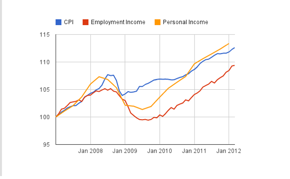
The two income lines on the above chart are in nominal terms and indexed to 100 in January 2007. Along with the two measures of income, I also show consumer price (CPI-U) changes. The first income measure is Personal Income, all income for all persons from all sources — a pretty complete measure I would say. The second measure of income is what I call Total Employment Income. I define that to be (Average Hourly Earnings of All Private Employees) X (Average Weekly Hours of All Private Employees) X (Total Nonfarm Private Payroll Employment). It's my attempt to measure employment income separate from other sources of income. If anyone knows a better or more direct measure, please let me know.
The chart confirms to me what the median household income trends show, that middle income earners have fallen behind relative to inflation because of the recession. While Personal Income has kept up and now exceeds inflation growth since 2007, Total Employment Income still has some distance to make up. In short, I can now make the exceedingly dumb observation that the recession hurt the real income of the average labor force participant.
But on a potentially positive note, if you re-index the three series to the technical end of the recession (June 2009), it looks like employment income is doing better than inflation to date (although not as good as Personal Income).
Inflation vs. Employment Income and Personal Income since the end of the Recession
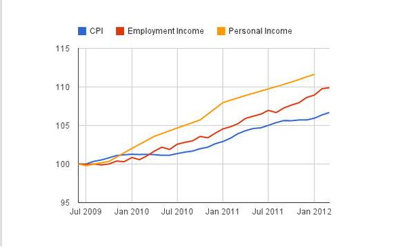
So perhaps the median household income measure for 2011 will reveal the bottom for this cycle was in 2010 and households will gain on real basis when 2011 statistics are released. If that's the case, I won't argue too much with the temporary pursuit of modestly higher inflation. I may not understand all of its mechanisms, but as long as inflation affects wages as well as consumer prices I am comfortable with it.
Miscellaneous Updates
Posted Monday, March 19 2012
It's been a while since I've done a roundup of site changes here on the blog. While things can sometimes appear quiet on the surface, I'm usually working on refining existing pages on the site or introducing new ones. Within the last couple of months there have been some enhancements that you might have missed.
First off, I've started using the BLS' new Smooth Seasonally Adjusted metro area estimates for metro unemployment data. This is nice because it allows us to compare metro unemployment rates to national and state unemployment rates as well as to each other. Previously the metro data was distributed solely in a non-seasonally adjusted form which made anything but year-over-year comparisons difficult.
In addition to the new unemployment data, I've also updated the income section of the site. I'm now using the American Community Survey's 1-year data to report real median household income (and soon other income metrics) for metros, states and the nation as a whole. Combined with the metro unemployment and metro jobs data, I think this relatively new ACS data will be extremely telling as we observe the recovery from a local and household-based perspective.
