
Employment and Home Prices
Posted Thursday, June 17 2010
Below is a chart of year-over-year changes in home prices (from Corelogic's national HPI data) versus year-over-year CES employment changes since 1981.
Y/Y Employment vs. Y/Y HPI
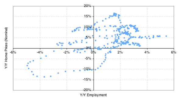
I've been looking at employment and home price data a lot lately, and I just had the desire to see what the above chart looked like. It kind of reminds me of a phase diagram. The comparison isn't completely fair because a real phase diagram should fully represent all the states of a system. What's the system in this case? The economy? I don't think we have anywhere near enough dimensions to represent that fully.
But taking what I can from the analogy, the system seems to like to hang out in the top-right quadrant most of the time (70% of the time actually). Looking at just the right half of the chart (where employment is positive), 92% of the points are in the top-right quadrant — meaning year-over-year home prices grew 92% of the time when year-over-year employment increased. By contrast, home prices rose only 59% of the time when employment was negative.
I don't expect these percentages have any predictive value, but they do kind of support my intuitive belief that employment growth drives HPI growth in a more stable manner than the other way around. Of course, the other way of looking at this is to say, well, we've had mostly growing employment and mostly rising home prices over the last 30 years. What else did you expect to see?
I think we can all agree, however, that the bottom-left quadrant is not one we want to visit often.
